Thursday, March 15, 2012

RSP Identity Final

For this assignment, I went through about five different concepts and ended up scrapping them all for better or worse. It got to the point where I was completely over-thinking it, and my ideas were just too complicated to realize in the time I had. Additionally, I think the requirement of creating four separate, consecutive images overwhelmed me. So, the only way for me to solve the problem was to keep it as simple as possible. This was a difficult concession for me to make, because when I do something excessively minimal it feels like I didn't do any work and people are going to call me out on it. This need to be complicated is my greatest weakness but also my greatest strength, in a way. In any case, I ended up doing four typographical designs based around sentences expressing my internal need to please people with my design work. I made an effort to be as consistent as possible with the type, colors, and recurring motifs in order to keep everything tied together. I thought about adding simple shapes to the design, but that quickly led me down the path of wanting to complicate it again, so I suppressed that urge. Perhaps the final message is too complicated for the sake of consistency with the series, but I wanted to include it because it is an important part of the overarching idea to me.


Tuesday, March 13, 2012

RSP Dating Strategies Final


Dylan Farr - Dating Strategy - Final

emily w final


Add me on facebook

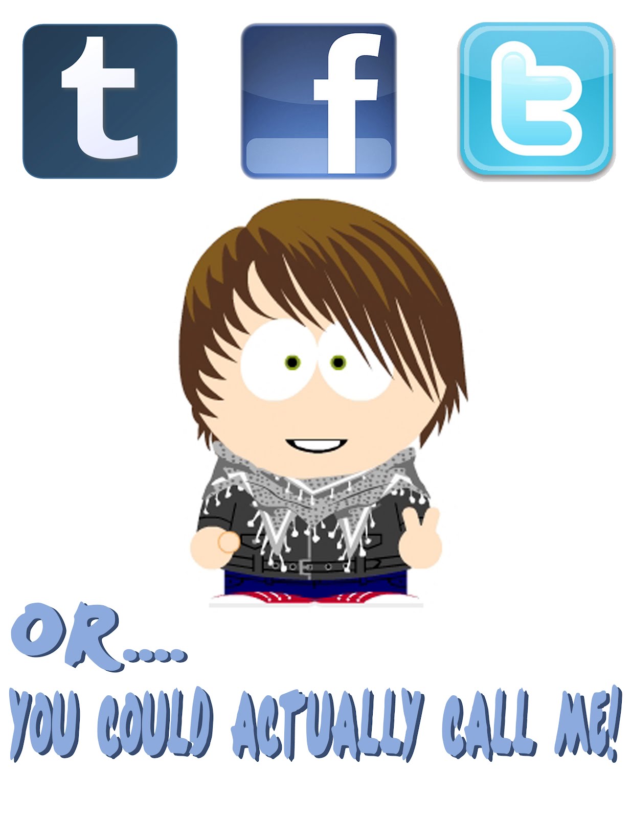
So for my project, I wanted to show that it's so common these days for me to just add you on facebook or follow you on twitter or tumblr, and less and less common for me to call people. I spend a lot of time on these sites, so i'm really just making fun of myself here.

"Who Nose" - Dan Kozerski


This piece of design was created by myself, Dan Kozerski, over the past few weeks, to be presented on March 13th, 2012. Who Nose is the title of the piece and its components for creation were photography, digital illustration and photoshop manipulation. Follow me as I walk you through the creation process.


Like I mentioned during the first critique, I really used the identity project as a jump off point for this project. While creating the identity project I had this really big problem depicting the nose because the head shots were straight on and I was making a monotone image. This got me thinking. Being that I do have a large nose, which I am proud of, I thought it was a great attribute to play off of for this project. Because I don't know how others feel about it I thought it would be funny to address it outright in a calling card.


When I I began sketching out some images I thought it would be really cool to go beyond the normal idea of a calling and create something unique. That's when I came up with the idea to reveal my nose through a pocket-like card with an insert. The person receiving the card is suppose to, according to the faint text on the front side of the insert, pull out and flip it to show my face.


I know this is sort of hard to explain; however, let me break down the final pieces that are above. The first image is the front of the card. The text reads "Who Nose," a play on the word "knows", directing the reader to the back side of the card, which humorously reads, "You Might Like Me." as well as my phone number. The front of the card shows a digital illustration of my head and hair. The inner most black area is cut out. to reveal the insert. The  bottom image is actually the front of the card. When inserted in the pocket it reads "Flip Me" very fainting through the cut-out. The image of the last is the back of the insert, which shows a selection of my head. When flipped this fits directly in the cut-out.

Though we were't able to print the last project, I hope you can visualize my intentions, enjoying the product as much as I do.

Monday, March 12, 2012

Identity Revised Final PL


Emily Iammarino - FINAL: Dating Identity


For my final project I decided to make small dating/info profiles on a few "typical" or "stereotypical" men that may be featured in a "What's your type?" kind of dating survey. When constructing this I was thinking of the quizzes seen in teenage girl magazines that ask girls to pick a type of guy that they think is best for them. So, my project would be constructed as a pocket guide/booklet that would showcase these different types of men.

Dating Final-Jenn

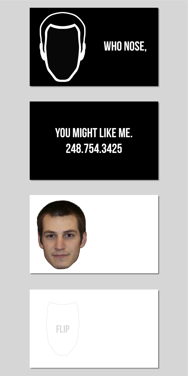
For this project I wanted to be straight to the point and show what it is I look for and what I dont look for when deciding who to date. These are all things that are deal breakers for me thanks to all my ex's giving me the opportunity to really see what it is I want.
So basically all I did was use the words that describe what I want in black, and then all the things I do not want in red. I layered all of the words a few times and altered the opacity and then put an overlay on top before I put the bolded words on top. I really am not satisfied with this project still, but was not sure where to go with it. I tried to use all of the input that I got in class, so this is what I finally came up with.

Dating Identity Final-Hundman

For my dating identity project I chose to make a list of dating deal breakers that I think many people can relate to. I titled the piece "deal breakers." I made the piece in Illustrator using all text which was different then what I usually do. It was a challenge to not use images but in the end I think it is still a successful piece.


BK - Dating FINAL

My Dating Identity project consists of 6 different front and back dating cards. They are entitled: Online Dating. The world of dating is changing drastically with the opening of new options. People are connected in so many ways, especially using social media. Although there's many types of social media networks, each have different purposes and draw a community that is interested in many different things. People also have certain qualities that are more prominent depending on the social media they use. For example, people use Facebook to be incredibly connected with their social circle and meet new people easily. I also have many of these social media accounts and so I pinpointed a certain quality I like in a man and placed them with a certain account.
I chose Avenir for the type because it is one of my favorite typefaces. I chose to make the covers very abstract and colorful because its the type of color scheme I typically use. I also wanted them to reflect the certain social media network indirectly.


Holloman - Dating Identity FINAL


I decided to title this project "For Me" because it lists a few things that I see myself wanting in a relationship with a guy. I created the entire piece in illustrator because I wanted it to have a hand drawn look, similar to how you might doodle in a notebook. I chose the color palette because I wanted it to be "girly" looking and I thought the colors went quite well together to create a nice look. If printed it would be an 11x17 poster.

Final - Kathie Trela


This piece is called Bangs. The point that I am trying to make is that my dream man needs to love my bangs. It is not obvious from the piece that it is all about my bangs, but you can get it by looking at the title. The eyes are supposed to be looking up at my bangs.

FiNALLL-BRiDGET PASAPANE


NM Dating Identity Final


6 ways to NOT get over a relationship
by Norma Macias
Materials: Photoshop and Illustrator

For this particular project I wanted to create six visual and verbal ways in which a person who has been in a committed relationship should not get over a break up. At one point in each of our lives we have dealt with separation from a significant other. Everyone deals with it differently but there are clearly positive and negative ways to handle the situation. My poster demonstrates the negative manners in which people sometimes deal with a break up. I really want the audience to reflect on their own experiences to see if they can relate to what I am communicating. I feel that even though these may be negative actions one can still look back on these experiences and learn/laugh about them. Therefore, this should be an enjoyable piece that commemorates all those past mistakes and hopefully help other people avoid them in the future.

Friday, March 9, 2012

Dre Sanchez - Dating Identity FINAL [100% done]

Update #6: Just posted up the original sketches for comparison's sake. Please see Update #5 for the completed poster. Now time to go print!!!! Hope everyone's projects are going great, by the way. I spent a lot of time on this, but I think the poster came out satisfying - at least to me. Ha.


Update #5: FINISHED!

Textured via Blend modes (Darken, Multiply, Divide). Photoshop.


Update #4: Yeah, I was fucking around too much with the blending modes. Photoshop.


Update #3: Lowered the top headline to be more reminiscent of the Monroe poster I originally saw as inspiration. Keep in mind, I am NOT doing an exact replication of that poster, but there are things I love about it. Indesign.


Update #2: Added headlines using Hobo typeface to keep '60s vibe; stroke applied to main headline "Woman;" fixed layout elements along grid (such as the red rectangle's alignment in actual composition). InDesign. Now, time for the vintage poster texture effect in Photoshop!


Update #1: Fixed contour stroke width; exported to actual framing size. Illustrator.

O.G. In-Progress Poster. Illustrator.


Here is the progress of my dating identity 11 x 17 poster. It should be done tonight hopefully. I still got put in the horizontal headline along the top and the vertical headline along the right, and hopefully can run a texture through it in Photoshop to give it a vintage poster feel. Maybe put a thinker stroke on the outline as well.