If you are social and generally liked by everyone, contact me at: facebook.com/bskay
If you are culturally informed and a copywrite creative, contact me at: twitter.com/bee #beccakang
If you are career driven and want to be successful, contact me at: linkedin.com/beccakang
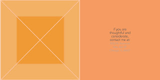
If you are considerate and want to write (not type) me a letter, contact me at: (my address) (for safety issues, not going to post that on the web...)
If you are fashion forward and confident, contact me at: lookbook.nu/beccakang
If you like to travel and collect, contact me at: tumblr.com/bskay
So one side would have the above type and I would complement the other side with geometric designs. I want them to look somewhat professional. I also think I may add one word to the design side.. such as (social) but I'm still debating.
The purpose of these calling cards would be that if we have a mutual interest or quality, then it would be appropriate to contact me. And this also speaks to the many outlets of communication that are available to people today. It's best to utilize each outlet for a specific purpose -- that's why they have become so popular. Also, it speaks to how dating used to be more face-to-face, but now people can be connected through the web without ever really physically being together. I guess you could debate if this is good or bad for any relationship.
This is what I have so far, still working on it. But this is the general idea. I showed them as spreads to show what would be on the front (illustration) and then the back (contact info). I think I'm set on the copy, just looking to play around more with the illustrations. I just want them all to be somewhat abstract and emanate the nature of which social media network I'm talking about. Also unsure if I should keep the back part (contact info) one solid color or different hues or just white.


def keep the tones that you got for the back. good abstractions too. really feelin the tumblr and the linkdn ones.
ReplyDeletethe only one you might wanna change is the address one, but that one seems to be compressed weird or something too. idk. maybe change the tone of the orange a lil bit or make the bottom font pure white to pop out more